Its location, on a lot with a clear view and north-south orientation, in one of the Island of Montreal’s most exclusive municipalities – a garden city with some 32,000 trees – won the hearts of the young newlyweds. Inside, however, the house had serious issues.
Brought in to consult, designer Martine Brisson identified the main problems immediately. Wasted space from the convoluted layout; a dated layout, with overly small rooms connected by narrow hallways; a central zone with inadequate natural light. It was clear that the only sensible option was to tear down all the walls and start from scratch.
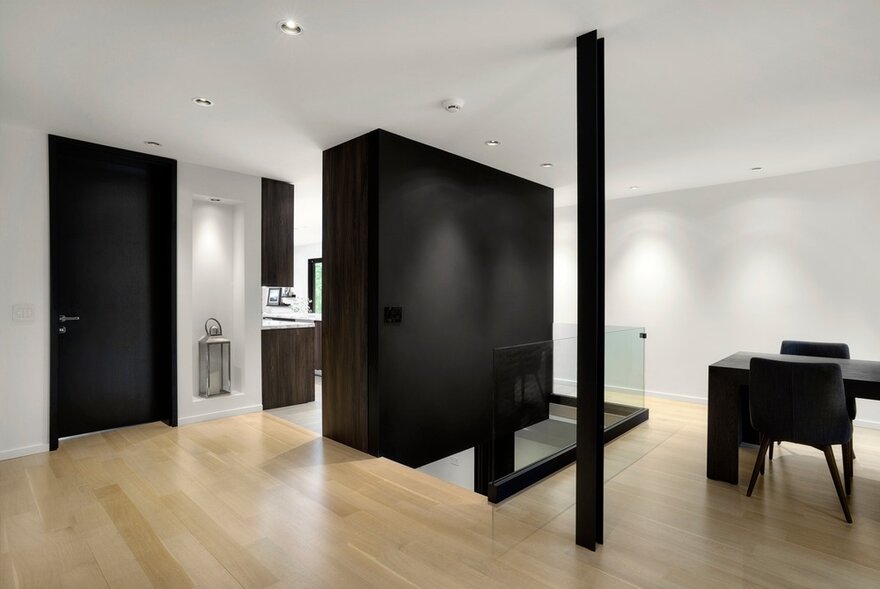
That being the case, the house’s structural soundness needed to be protected. This major constraint was overcome with long steel crossbeams and two full-height vertical modules. In the absence of load-bearing walls, these elements distribute loads to the centre of the T-shaped layout and to the southern wing.
Martine Brisson always approaches the design of an interior by paying special attention to how people move. “That is the most important starting point for a project. In my view, traffic should determine a space’s volumetrics,” she says. Being able to move about freely means having a choice of different paths from room to room, secondary routes within rooms, the ability to detour easily around service areas.
Once the building had been transformed into an empty shell, the layout was established based on the position of the entrance, which leads directly into the living room, without a clearly delineated vestibule. “The farther we advance, the deeper we go into the owners’ personal space,” the designer explains. At the same time, major work was done on the windows, with the addition of new openings, particularly in the south wing, and the expansion of existing windows.
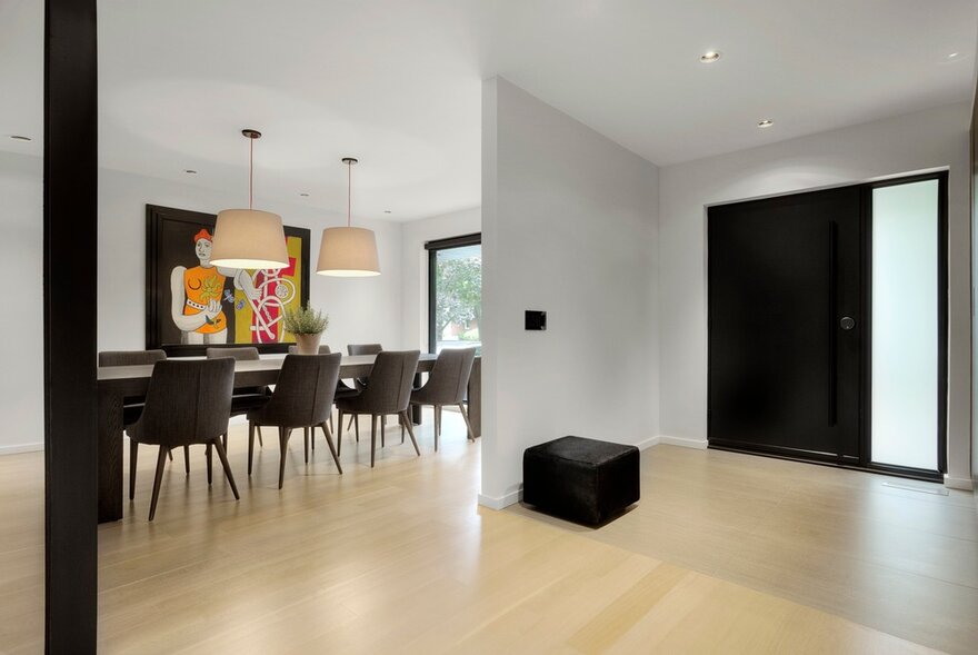
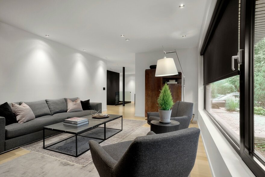
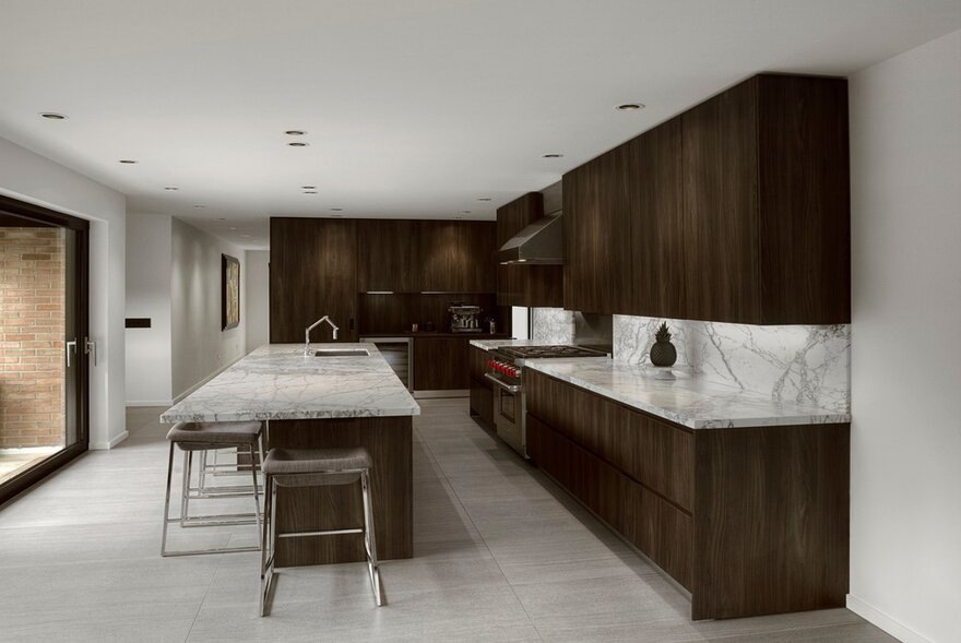
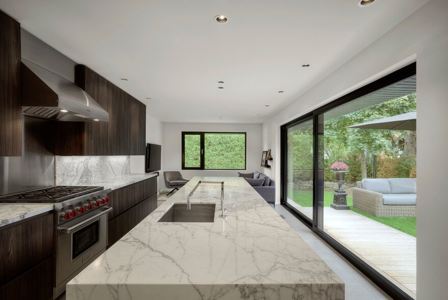
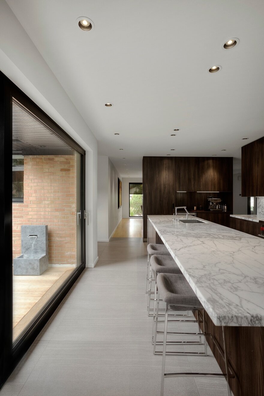
As a result of removing the walls, the living spaces are now merged and natural light floods the ground floor. By changing the perception of volumes, the combination of the crossing effect and the luminous effect creates the illusion of a space much larger than it really is. That impression is strengthened by the uniformity of surface treatments: a monochrome black/white/grey palette, white knotless oak for the hardwood floors, thermoformed espresso oak for shelves and cabinets. With one exception: the kitchen.
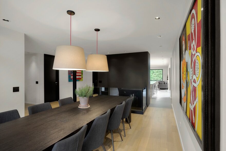
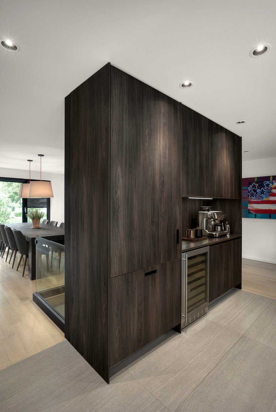
“The client wanted an island with a white Carrera marble countertop. After discussions, she agreed with my alternative proposal: grey veined Calacatta marble, used intensively.” Covering the island and its waste chute, work surfaces and cabinet corners, the decorative material became a powerful element in an otherwise minimalist space. Directly ahead of the food preparation area, but defined by a wide traffic area, is a floor-to-ceiling wall unit. First and foremost a load-bearing element, it performs numerous additional functions. On the dining room side, it structures the stairs leading to the basement and partially screens the open kitchen. On the other side, it contains a wine cellar, espresso bar, china cabinet and storage for various cooking implements.
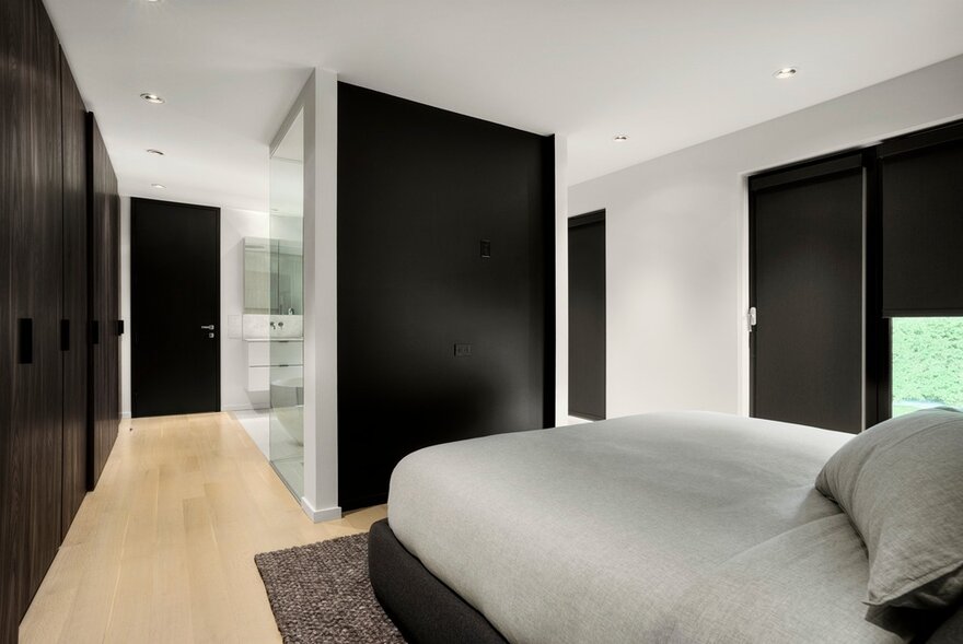
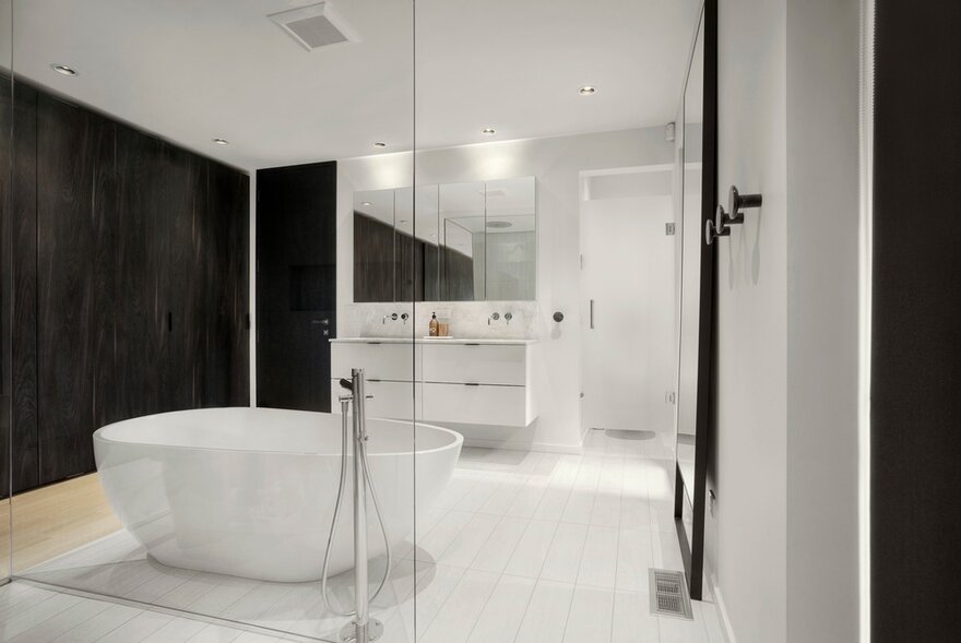
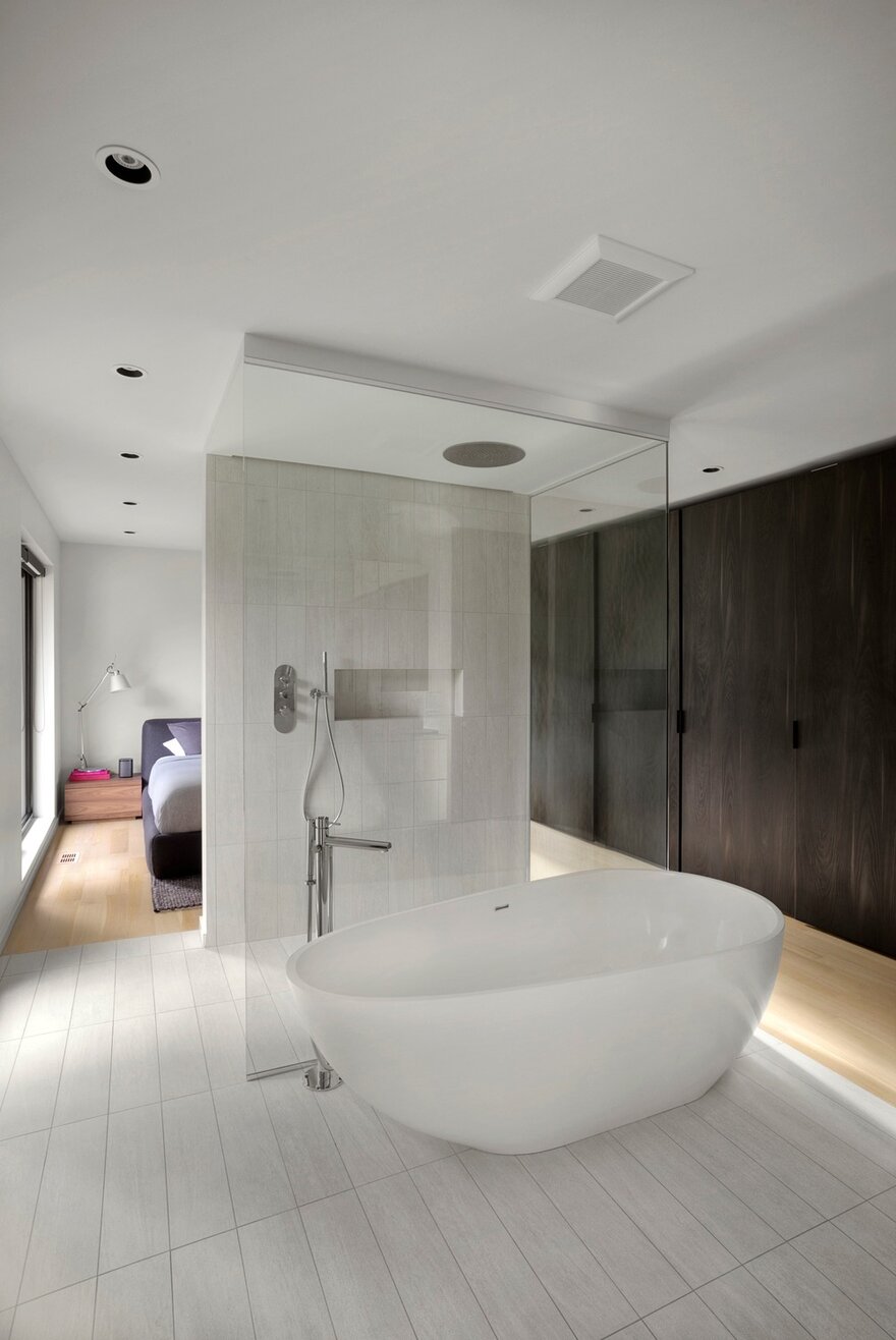
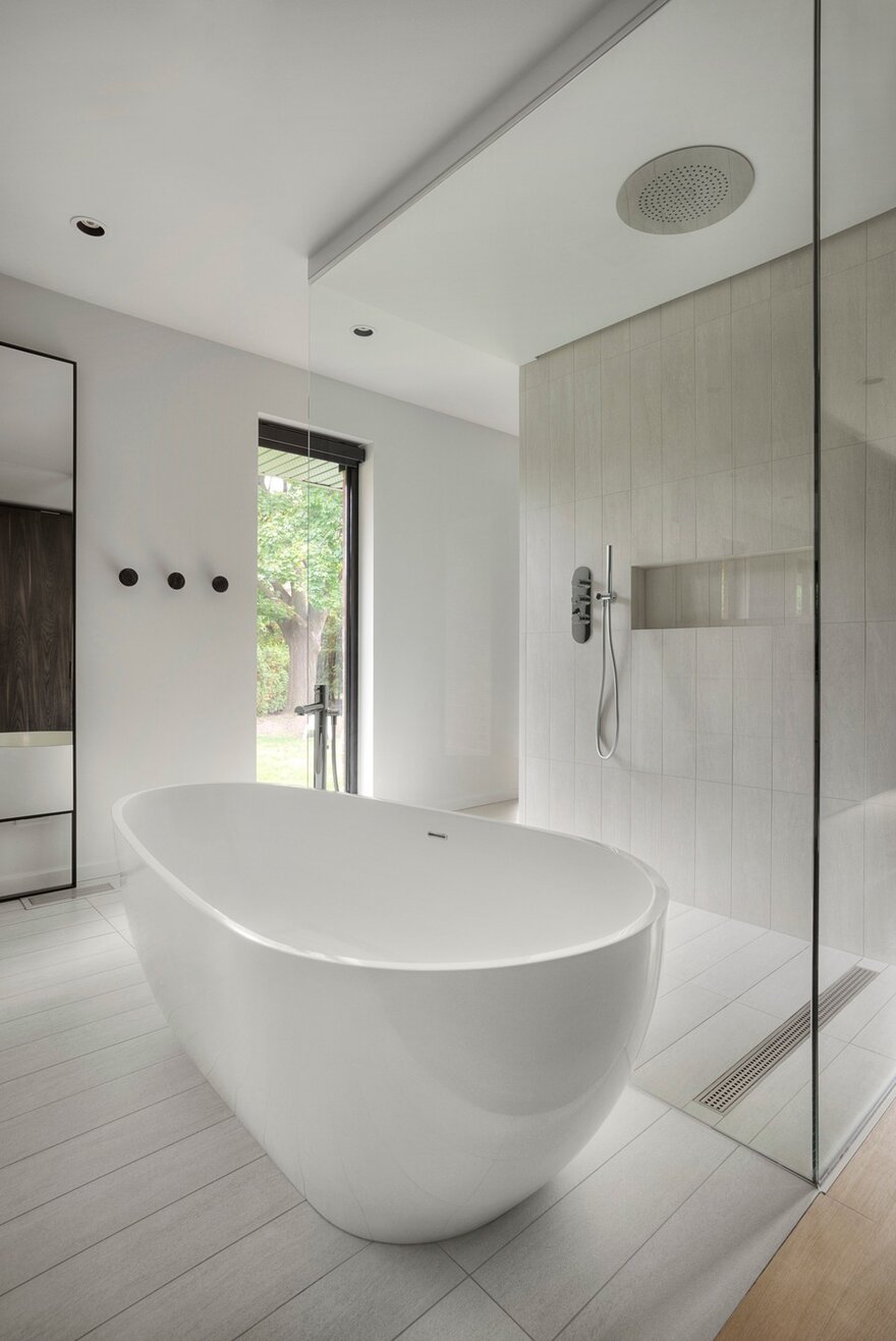
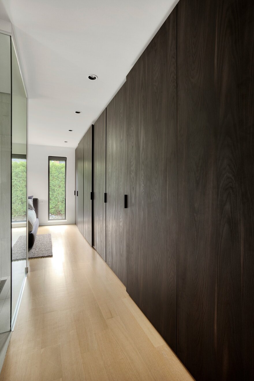
The scenario is reprised in the private spaces of the southern wing, where the master bedroom and a bathroom share a single space. Here, a section of wall backing the shower stall plays the structural-support role. It defines the two zones without carving up the volume, while providing the privacy needed for bathroom use. Invisible from the bedroom, the sanitary fixtures are arranged behind in order to keep the lateral walls clear.
To increase the crossing effect a little more, the project manager suggested adding a porthole facing the door to the common area. The window’s strategic position at the end of the north-south passage across the ground floor has a magnetic effect. Upon entering the room, simply leaving the door open instantly draws the gaze to the outside. By removing physical barriers and increasing the number of exit points, Martine Brisson helped the newlyweds chart a new course.